This month I attended two perennial end-of-August events; the Writer’s Digest Annual Conference and the US Open qualifiers. Each always inspire and jump start me for the last quarter of the year.
The first week of the Open, Fan Week, is free and showcases up-comers or over-the-hill veterans and allows fans to see play up close before the place becomes a mob scene next week. Like art and writing, the way to get better is to see and read someone better than you.
Tennis can also be very depressing. For someone like me, it’s a giant yardstick of my age, watching familiar players fade and run into tennis friends in Flushing and learn they have dropped out of the sport for either hip or knee replacement. And some have switched to pickleball.
But returning from the US Open Qualifiers always inspires me to try to get back in shape and at the very least, get back on the tennis court. But as I write this, while eating blueberry pancakes, it is raining and expected to for the few days. So, until then I will be writing in front of the fireplace because the same can be said for the Writer’s Conference. By the time the four days ended, I couldn’t wait to get back to writing, not just humor pieces but more long-form. I am now revisiting a book I really would love to one day see published, The Sea Below Us, a graphic novel set in 1850. One of the famous bestsellers giving a rousing keynote to the crowd and shared that she rewrote her first book 127 times. If that were me, I’d still find typos.
For the casual reader of The Bob, some giggles and drawings here are more than enough but I would like to share specifically some of the take-aways from the conference for the writers here and that will be in next week’s paid extended edition. It will be more of a mini-class and I hope it helps.
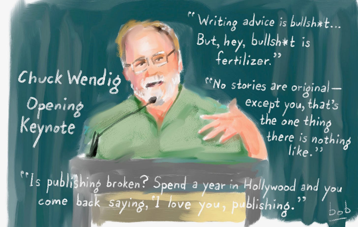
A couple of drawings I did at the Writer’s Digest Annual Conference.
And thanks to Greenlight Bookstore in Brooklyn for being there and including my book.
2023 NFL Logos Power Rankings
Published in Run Your Pool
Branding is a billion-dollar business with uniform changes and logo tweaks as carefully planned as the X’s and O’s on the field. We would argue that football is the country’s most popular sport because of the catchy graphics we all grew up with. As sports commentator Mike Francesa said, “It was the perfect sport for color TV.”
This year almost half the league will be either changing their uniforms and logo or bringing back retro looks so it’s time to break down the new looks—it’s hard to root for a team if you can’t tell who’s on the field.
We have taken into account not only the logo’s design but concept, tone, and whether it accurately reflects the location’s sensibility.
One note on my credentials: I have taught at art schools around the world, created logos for corporations like Pepsi, worked for Sports Illustrated, SPORT magazine, and The New York Times sports as well as designed the logo for an NFL (defunct) team. I have been drawing NFL logos since the fourth grade.
We will discuss the worst logos later but, for now, who looks good in 2023?
17. Kansas City Chiefs
You can tell the organization senses they have nowhere to go with this. They have not been able to improve on the problematic brand; blood red helmet, the Indian association and a yellow accent to the uniform resulting in a picnic-condiments look. That’s what you get when you have the logo designed by the owner (in 1960 by Lamar Hunt). Just spitballing here…change to moss green or wheat yellow, do a gradation of both, like a Great Plains thing? Perhaps add an Indian casino chip? See, problematic.
16. New York Jets
Go back. Your original logo (on the left) was the best version. The more complicated the logo is, the more it distracts your fans from how bad you were on the field. None of this works if it wasn’t for the seldom-used basic green, which they are smartly returning to this season for their throwback uniforms. Those white uniforms are always underrated for their visual effectiveness. Too many teams have their teams looking like popsicles.
15. Los Angeles Rams
When this team first introduced the ram horns in the league, the helmet’s swirls and quarterback Roman Gabriel, hypnotized opponents. The change from white to yellow was an improvement. Ideas for an upgrade? What if the swirls moved? First hologram helmet!
14. Arizona Cardinals
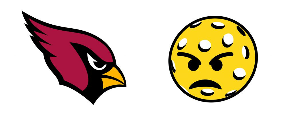
The latest version of the cardinal was very professionally executed—not too complicated and works better than all the NFL cat family logos. The only shortcoming being the cardinal is really a St. Louis thing and has nothing to do with Arizona, where pickleball is more popular than football.
13. San Francisco 49ers
Somehow they pulled off a glorious Old Wild West color scheme and logo for a football team without looking silly. Rumors of upgrading to reflect the new San Francisco have been kept at bay but here was a sketch.
12. Minnesota Vikings
Purple. Minny, you’re the only ones who thought of that color way back when. Bravo. My suggestion…real horns sticking out? The Vikings will be wearing their throwback jerseys in Week 1.
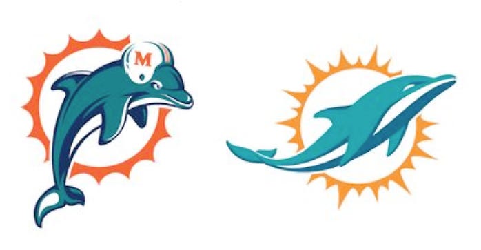
11. Miami Dolphins
Perfect example of there being room for wit in football design. I’m of course referring to the original design and not the new one is very popular and it is beautiful, but it’s not as personable, charming or funny as the one with the dolphin wearing a ill-fitted helmet himself. Thank goodness they didn’t change the colors. Best example of matching the town’s vibe.
10. Pittsburgh Steelers
Iconic. Clever just lifting the city’s bread and butter, a factory logo. Equally clever, and also budget-minded, is having the logo appear on only one side of the helmet. It’s the only major sports logo that uses the three primary colors set on black (not counting the ugly Kansas City Scouts). It’s a well-thought out and appealing uniform. Plus, a trillion Super Bowl rings gives this logo a priceless patina you can’t buy. They also have the funniest throwback uniform ever, their 1934 bubble bee uniform which may never return as the team hinted their 1966-1967 throwback design with diamond-shaped cape across the shoulders will be making an appearance during the 2023 season.
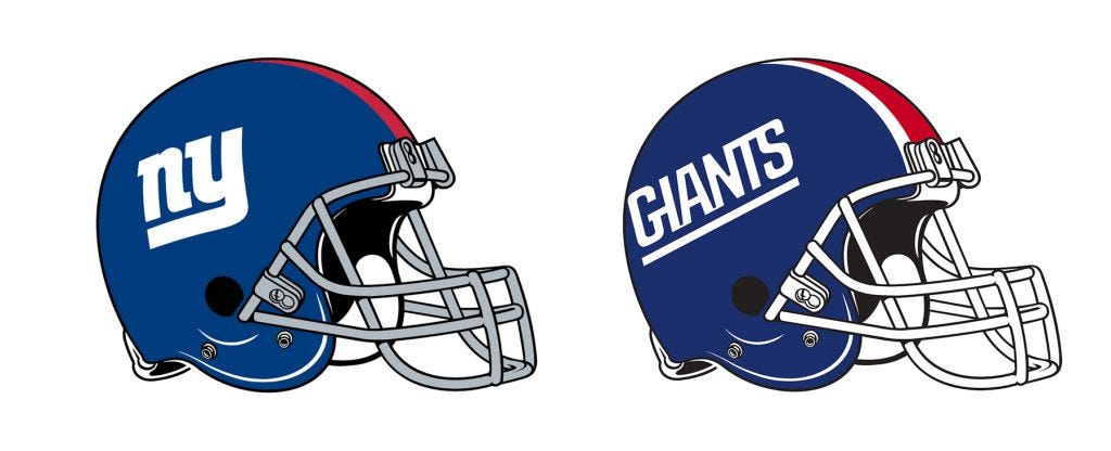
9. New York Giants
This is a logo that is good only because you so familiar with it. Like how everyone on a comedy sitcom starts looking good by season ten. (I.e., How I Met Your Mother), or when you hear the word Beatles or see the Yankees logo. It’s no longer just a lowercase N and Y. The Giants have tried other logos but always returned to their granddaddy. Another example of leave well enough alone and stop experimenting.
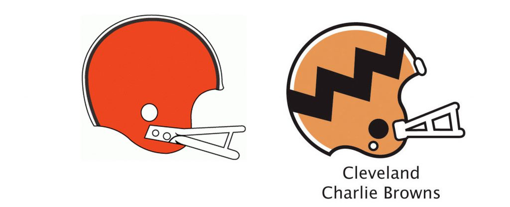
8. Cleveland Browns
No other team uses this color palette or has a helmet with no logo. Their genius is they dare to not try too hard. On the field either. They are lovable because less is more, in both cases.
7. Green Bay Packers
Underrated. Nothing here makes sense yet it works because the color combo is unique and the logo is so uncluttered. I don’t even know what the team name means. I don’t care. The contrast to whoever they are playing on the field actually sets them up as the underdog and you want to root for them. My one suggestion is don’t stray from the original green with these dark colors like the Eagles and others. Stay in your lane. Lean into it.
6. Indianapolis Colts
Sometimes the first idea is best. Back in 1953 somebody did a half-ass job, throw a horseshoe on the board and got lucky, pun intended. Hope they never change it.
5. Detroit Lions
Fantastic color scheme uniform with an above-average logo. Reintroducing the classic logo for throwback games, which looks like something for a 1970s muscle car, is another touchdown.
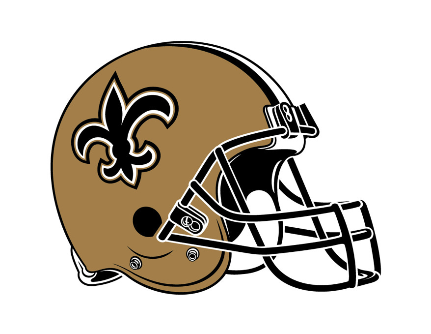
4. New Orleans Saints
The cheesier the league’s other teams’ experimental uniforms look, the classier the gold fleur-de-lis gets. The restrained, elegant helmet has been worthy of a dynasty that never was (The Big Easy won once in 2010).
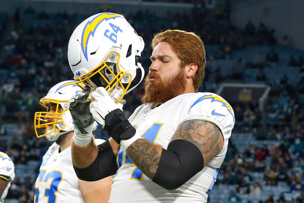
3. Los Angeles Chargers
Simple yet brilliant to have the number on the helmet. The right graphics, the right font, the right colors…they should give up football and open a design firm.
2. Dallas Cowboy
Classic look and part of the reason, along with their half-naked cheerleaders and winning ways, they are so appealing, and we are stuck with their fans no matter what away stadium they are playing in. No suggestions as this is impossible to improve upon.
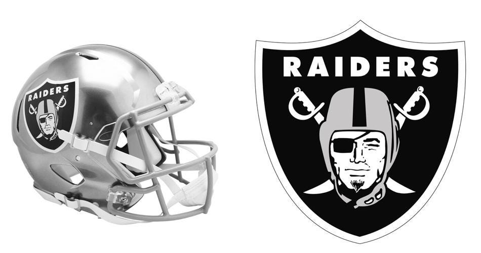
1. Las Vegas Raiders
There’s a reason this logo has been always the most popular NFL logo, especially among people who are a little deranged. It speaks to the fan base, the fear factor you want a team to project with a color scheme that is menacing and never out of vogue. It IS overdue, in these politically-correct times, to upgrade the guy to look less like a soap opera star and give him some diversity. Maybe a goatee. Piercings?
Three Questions. I’m excited to include my next guest, me. I’m an award-winning humorist, New York Times bestseller and the world’s only snowman expert (author of The Illustrated History of the Snowman). Follow me on Instagram at @bob_eckstein.
Bob Eckstein: What makes for a funny illustration or cartoon?
Bob Eckstein: There are no set rules, of course, and that’s really what makes it exciting, but some generalizations can be made. It is often necessary to start with something familiar—a set-up, something using clichés and symbols. An idea for a joke or cartoon can come from anywhere and in a different way each time. Sometimes I mishear or overhear something at a party…or see something, walking down the street. Then I add an element and/or action which creates tension or conflict, and the kicker that is unpredictable that defuses the tension. Of course, this explanation kind of sucks the fun out of it, and I don’t consciously think this way each time I try to craft a joke or cartoon.
BE: Where do you get your ideas?
BE: There’s a store. Seriously, whether you’re an advertiser, writer, designer, comedian or ANYTHING creative, you need to get your mind at some point into a state of playfulness.
BE: If you could go back and change anything about your writing career, is there anything you would choose to do differently?
BE: This sounds like sour grapes, and it’s more popular to profess that one has no regrets. No, I have a lot, so there. One regret that I still pay for is not going to Harvard. I never applied, never was encouraged and no one explained it would be key in this business. If I am asked one more time by a comedy writing room if I worked on the Harvard Lampoon I’m going to punch someone. Not sure why one has to go to Harvard to be funny.
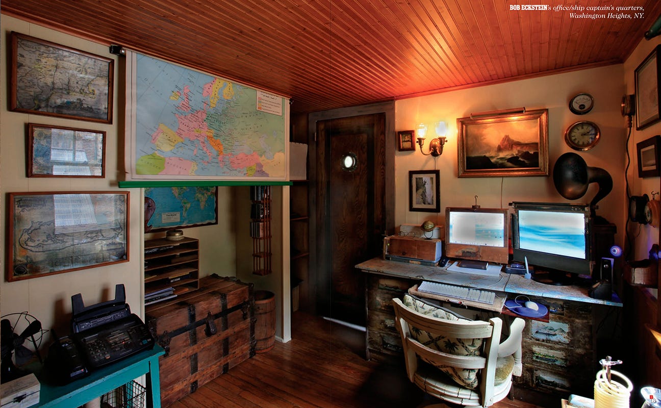
I usually have to write this section twice and this time is no different. I initially thought it will be very entertaining to share the scuttlebutt I heard only to realize its not only oversharing but there’s a fascinating round-table discussion on the State of the Union for gag cartooning published in the latest American Bystander, that is more interesting than what I was going to say. If you are a cartoonist, you are really going to want to check that out. It’s rare to see such an open discussion. The magazine is available here for $5. The magazine is packed with cartoons from many top cartoonists and it even includes a photo of my office.
It was commonplace for the illustrators of the 1970s and 1980s to totally trash colleagues and inferior work in publications covering the industry (there is a lot less industry reporting in print, but plenty if you venture over to the Daily Cartoonist, Seth Simon and newsletters like this one. You’d be shocked seeing some of the quotes which I was reading on blogs documenting this sort of thing.
So meanwhile I will share the points made by award-winning author and writing coach, Ryan G. Van Cleave, Ph.D. at the Writer’s Digest Annual Conference this year. I’m going to paraphrase what I learned. These may sound they are stating the obvious, yet I DO know many who don’t follow these tips. First, the number one thing is produce clean copy. And this would include captions that are error free. I’m actually the worse when it comes to typos and part of that is my stubborn grudge against using WORD’s Editor to spellcheck. But I left the conference promising to clean up my act. No more sending anything out the door until it’s double proofread (I hope you don’t find any typos in this newsletter).
The second bit of advice was to meet deadlines. THIS is something I’m very good at. I know some who have argued this point with me, “Would you rather it be on time or have it perfect?” On time, I would say. I had to fire people when I was an Art Director. Their work was good but as the speaker, Ryan G. Van Cleave, explained, quality is not the most important trait to being successful.
The third point is something I and others preach, too—be nice. Nobody wants or needs to work with anyone they don’t like. I’ll go one further. Nobody needs to work with or hire someone they don’t know because everyone knows, or is related to, a writer, illustrator or graphic novelist in need of work. Nobody needs to hire a stranger. It’s always better to be nice.
Well, I have stopped getting questions and cartoons for me to critique, I suspect as a result of my bluntness and unfiltered answers. That said, all I have are these photos of the bear (we named Barry) that comes by my house occasionally.
You can meet me at the following upcoming events:
Milford Readers & Writers Festival (Milford, PA) Sept. 22-24
Miami Book Fair (Miami) Nov. 12-19
Erma Bombeck Writer’s Workshop (Dayton, Ohio) April 4-6, 2024
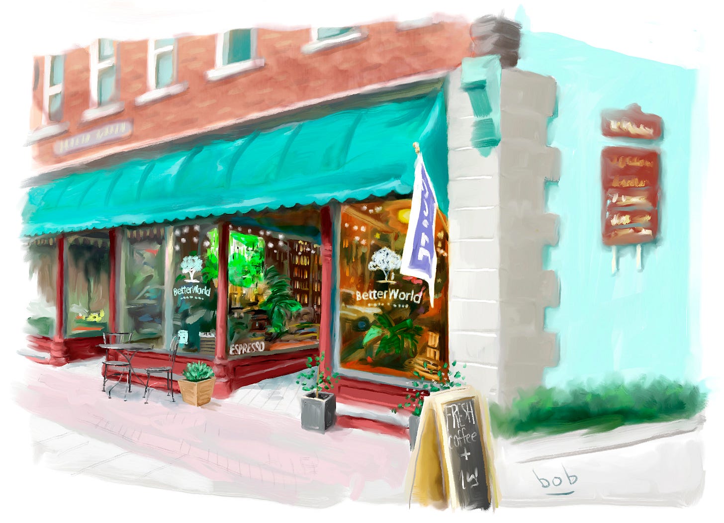
Special thanks to Liam of Better World Store, the bookshop working the Milford Readers & Writer’s Festival this year, Sept. 22-24. They are located on 320 Broad Street, Milford, Pennsylvania and also serve my mom’s favorite coffee.
To order online at Bookshop, CLICK HERE.
I also sell lots of fun T-shirts (and iPhone covers, pillows, notebooks, mugs, wall art, totes, hoodies, pins, stickers, magnets, even tapestries) of my designs.). Check them all out here.


Thanks for reading. And thank you for spreading the word and your support. The Bob has been making Best Of lists for newsletters.





















I posted this to my channel; I hope that's OK. (being that my real name is also "Bob" I feel a certain sense of kinship)
I'd be honored if you found something of mine you liked well enough to cross-post.